Suzan Lovett
| Fan | |
|---|---|
| Name: | Suzan Lovett |
| Alias(es): | |
| Type: | Fan Artist, Fan Writer |
| Fandoms: | Star Trek, Blake's 7, Starsky and Hutch, The Professionals, Wiseguy, Man From UNCLE, Homicide: Life on the Streets, Harry Potter, Highlander, Sentinel, Stargate SG-1, Lord of the Rings, Smallville, Star Wars: TPM, House MD, Torchwood, Beauty and the Beast (TV) |
| Communities: | |
| Other: | Partners R More - Artwork by Suzan Lovett Suzan Lovett - The Reading Room |
| URL: | Suzan Lovett at AO3 |
| Click here for related articles on Fanlore. | |
Suzan Lovett is best known in fandom as a prolific fan artist, and has also written slash and gen fanfiction.
Suzan started drawing for Star Trek in the early 80s, she has done hundreds of illustrations in many fandoms; het, gen and slash.
Her artwork has won dozens of awards, including Fan Q Awards, Huggy Awards, Stiffies, Surak Awards, SlaSHies and Screwz awards, in addition to art show awards at various conventions.
In 1997, she was the Fan Guest of Honor at the Farpoint convention.
Because Suzan began drawing in the 1980s and 1990s for fanzines and for sale at conventions, much of her work is not available on the internet. In the early 2000s, however, she sold prints of her art via the web, as seen in the Wayback archived sites squidge.org and kixxster.org (an incarnation of her old website). Some of her fantasy-based Blake's 7 art is currently archived at the Blake's 7 Guide and in a Blake's 7 Fan Art Gallery.[1]
Suzan's fanfiction is available at her new Partnersrmore site. In the mid 1990s, she was one of the first group of Starsky & Hutch slash fan writers who agreed to allow their fan fiction to be publicly posted online.[2]
Blanket Permission
In 2018, Suzan gave the following blanket permission: "Blanket permission for non-commercial remix, podfic, translation, art or fanvid creations or secondary fanwork creations of any of my fanworks EXCEPT my Star Trek fic. Please credit Suzan Lovett." [3]
Acafan Use

Suzan's art was used on the cover of Enterprising Women; it is an illo that she later said was not particularly well-done. [4] , See the original work at Nome #8 (1985).
There are also three of her illustrations used as full-page examples of fanart in Textual Poachers. One illo, however, an explicit slash one did not appear in the book, as per Suzan's request. [5]
Interviews
- Legacy Interview with Suzan Lovett (2007)
- Scribbling Women: Artists Talk Back: Suzan Lovett (2007)
- Meet your Starsky and Hutch fic writers/artists: Suzan Lovett (2016)
- Media Fandom Oral History Project Interview with Suzan Lovett (2017)
Her Fannish Firsts
Lovett's first con was Star TreKon in 1980.
Her art was printed for the first time in R&R #14 in February 1981.

While Lovett has stated she doesn't remember what her first published fan fiction was, it may have been "Consequence" in Vault of Tomorrow #2 in January 1982. [6]
Lovett's comments in 2007:
1980, my very first con, Kansas City TreKon, where I saw my first fan Art Show and thought: Hmmm, I used to draw. I wonder...? I must admit that the real reason wasn’t so much for “art’s sake” as it was for sheer money, or rather, the lack thereof. The paycheck coming into the house at the time simply couldn’t cover too many indulgences, I’d just discovered zines, hankered for more and I thought contributors copies were a great idea. I put together a small portfolio, Xeroxed them and sent them to the editors of the zines I’d bought. I had all of three. Galactic Discourse, Contact — the editors of which both bounced back my drawings, Bev Volker & Nancy Kippax telling me they weren’t good enough to be in Contact, Laurie H. saying essentially the same thing about Galactic Discourse, but very gently... The third zine was R&R, and — well, Johanna Cantor kept it cheap mostly to give the new writers and artists a place where they had a chance of getting printed. She sent me two stories to illustrate, mentioning she’d prefer ink, but if I preferred otherwise, she was fine with that, as long as I understood she’d be simply Xeroxing them and I shouldn’t expect perfect quality. She’s the only reason I kept on drawing. She kept sending me stories and printing my drawings until I got better and the other zine editors started noticing and asking for work, accepting pencil work, until I had more and more reasons to improve. [7]


Lovett's comments in 2017:
[When I went to Star TreKon, I didn't know anybody in the fandom before then. I left my daughter with my husband and I just got on the bus and went by myself. I even had my own room. I was operating under people under the impressions people normally operate when they go off to things, you know, sharing rooms with other fans, all those things. They weren't on my radar at the time....
Well it was very exciting just to have people to talk to that had the same interests and uh, people of all ages, colors, and even nationalities. It was a it was a melting pot. And I, and I absolutely loved it. In fact, be before the end of the convention. I, uh, I walked into the dealer's room absolutely shocked that there was so much stuff, professional stuff and fannish stuff. Until then I had read professional Star Trek books professionally published, and they weren't any good. So I looked at, in the amateur ones and I thought, well, if the professional ones were so bad, what do I want with the amateur was, but of course there was, you know, really pretty illos. So I bought a couple of them, read them in my room that night. I went, oh, wow. Now I want everything. I had , taken just enough money at the time, you know, there wasn't the kind of, you know, cards and things that we use today. So I had just taken some cash with me, just enough to go get through the convention. And, so I invited a lady I had met the day before and had gotten along with very nicely to share my room and let me put, and she would sign her meals to the room and I pay everything with my charge card so I can have the cash to go nuts in the dealer's room, which I did. And then I packed up my clothes and mailed them and put the zines in my bag so they wouldn't be hurt on the way back. [8]

More 2017 comments:
Pen and ink has always been extremely difficult for me because it's so unforgiving. That was one of my problems when I first started trying to get accepted into the zines. I would do them in pencil and charcoal or a pencil and it was a lot more expensive to get that printed pen and ink could be just be xeroxed, which is one of the reasons they wouldn't accept my artwork because it was going to be so expensive. To get it produced and it wasn't worth putting that kind of money in it.... Connie Faddis you know, they could certainly do that kind of work [for her] and the editors would happily put the money in, but not what I was able to do then. So I had a few pen and ink pieces, but mostly, I worked in charcoal and pencil for the longest time.... It has always been my favorite medium. I wasn't even doing color pencils at the time. It wasn't until I got, years later, I got into Starsky and Hutch, that's when I did my first color pieces. [9]
Awards
Some of the art and fiction awards Suzan Lovett has won:
- Fan Qs: 1988, 1990, 1992, 1993, 1995, 2002, 2003, 2010, 2017
- Huggy Awards: 1986, 1989, 1992, 1993, 1995, 1997, 1999, 2001, 2003, 2005, 2007
- Stiffies: 1993, 1994, 1995, 1996, 1997, 1998, 1999, 2000
- Surak Awards: 1986, 1987, 1988, 1999
- SlaSHies: 2006
- Screwz: 2003, 2004, 2005
Other nominations:
- Fan Q: 1983, 1987, 1999
Illustrator
Suzan's favorite medium is graphite pencil on cold-press pen&ink boards because of the way the pencil flows on smooth paper and the different results one can get just by simply layering and/or varying the pressure on the same tool,[10] but work as a fanartist in the past was often limited by what editors could reproduce. For Suzan it meant that "getting pencil work reproduced was expensive, so I was told to draw in ink if I wanted to be in a zine, and for a while I did.[11] It's an unforgiving medium, and my work needs a lot of forgiving, then and now, so I was really happy when I was finally able to get pencil drawings accepted."[12]
Her early work in 1980 was pretty erotic. When asked to explain her limits, she said that she had no qualms about drawing erotic art, but there were some subjects (S&M, etc.) she refused to do[13] and that she tried to capture love. "[I]n any case, though, I mostly want a drawing to give form to an idea and/or distill a story into an image."[14] When she was asked what inspired her to draw Kirk/Spock (TOS, she said that drawing K/S wasn't about expressing her own vision, but about giving life to someone else's alternate universe. Making a distinction between an artist and an illustrator, she explained: "I'm not an artist; I'm an illustrator, and illustrators are mainly story-tellers, in shapes and forms rather than words."[15]
In 2017, she commented:
It wasn't until I got into Professionals that I really got into thinking about writing slash probably because there was hardly anything else in that fandom.... I was doing slash illustrations because illustrations as when you're doing not the things I want to draw myself, but when you're illustrating a story, you're simply giving form to somebody else's ideas. So I was doing slash, illustrations [in Pros]. Yeah. From very early on because it was their ideas. I couldn't quite get a Spock and Kirk into slash in my own head, but as long as it was somebody else's story I was reading or ideas, it was fine.
MG: I would have a very hard time drawing something was not my taste or anything that I was interested in because there's so much labor that goes into it.
SL: It wasn't taste. I liked it. I liked reading slash. I liked slash stories. I just couldn't get it as a starting idea in my own head. When you're writing your story, you have to put in all the emotions and all the justification for it. And I couldn't come up with them on my own, but if somebody else came up with them, I thought the pictures that went with them should be quite beautiful because I thought the stories were quite beautiful. I never had any problem reading slash or drawing. Slash the idea was just fine to me. I just couldn't build a slash universe in my head and when you're only writing it has, it has to come from you. When you were drawing somebody else's story, you're just giving form to their ideas. I liked their ideas, I just couldn't come up with them myself.
MG: were you ever asked to do an illustration for a story that you turned down because you were not interested in the story?
SL: Yeah, I can't remember any specific instances, but there were times that I kind of demurred and said, oh, I don't have the time. Because I did not think a specific writer was really writing anything....
I do not like drawing S&M pictures. If the story went that way, I wasn't going to do it. That and also in later years there had been, there has been some brothers slash which I found a scruple and that's it.... There are a lot of fandoms and pairings that I'm simply not interested in. Even in the fandoms, I am very much interested in. I mean... I love Starsky and Hutch, but I don't want to draw a Huggy and Hutch, which I was asked once and politely turned that one down. [16]
The Use of Photo References
The use of live or photo reference models is a common technique among illustrators. Photos, advertisements, poses from gay porn zines, even drawings of gay artists like Tom of Finland have all been utilized by slash fan artists.
Many of the male figures that Suzan drew were based on professional photos and advertisements.
The back cover of Master of the Revels came from an ad for home pregnancy test kits in the 1990s. In Chalk and Cheese #18 there is a drawing of Bodie in a tux with his tie undone and Doyle, wearing blue jeans and a cut off top as he shoves Bodie up against the wall. [17] The photo reference was a 1990s ad for perfume. [18] The body of Bodie in handcuffs on the cover of Leather and Blue Jeans #2 was from an ad for The Advocate, a gay newspaper out of Los Angeles. Fans would often play "guess the ad" and would approach Suzan at conventions who would cheerfully confirm her sources.[19]
A fan in 1995 wrote:
I (and other people I know) tear out copies of pretty men (especially pretty men together in nice poses) and SEND them to my artist friends (Suzie, [Alexfandra] and others) in the hopes that they'll inspire future art. It never occurred to me that having fan artists draw from those pictures would be a bad thing.
I saw the beautiful gay ad in Advocate Men that Suzie turned into the "Bodie with nipple rings" and had *I* tried to copy it, it wouldn't have looked *anything* like that (or anything like art, either). I do have more problems with the almost exact same poses showing up in different fandoms, but I know that people come up to Suzie and beg, 'I *love* that pose, couldn't you please, please do it for *my* guys instead of the icky guys you already did it for?' [20]

poor photocopy of an unidentified photograph printed in Strange Bedfellows #5 (May 1994)

2000. The cover of the Due South zine Thank You Kindly by Suzan Lovett -- "Holding Beauty" won a Huggy Award in 2000.

Photo reference for a Suzan Lovett illustration: the cover of the February 9, 1989 issue of Rolling Stone, featuring Jon Bon Jovi

by Suzan Lovett, the illustration opposite page 30 from Harlequin Airs, Doyle, a white horse [21]

back cover of Master of the Revels. A 1990s advertisement for "EPT Home Pregnancy Tests" was used as the photo reference for this piece

the 1990s photo reference, an ad for a home pregnancy test

back cover issue #2, Suzan Lovett, Prisoner of Love. Many fans point to the back cover as one of the examples of Lovett using gay ads as body doubles for the characters. This image used a photo ad for "The Dungeon" from The Advocate, a gay newspaper out of Los Angeles, as its photo reference. Winner of a 1995 STIFfie Award.


Her Evolving Art Style and Fan Reactions To Her Art
As noted above, Suzan's early style was often limited by what fanzine publishers could easily reproduce. Her initial Star Trek ink illustrations are often spare and simple. In fact, as Suzan herself wryly points out, her first few art pieces were rejected by zine publishers:
Bev Volker & Nancy Kippax, the editors of ….Contact...both bounced back my drawings...telling me they weren’t good enough to be in Contact. Laurie H. saying essentially the same thing about Galactic Discourse, but very gently, and also suggesting that if I want to be printed in zines I might want to draw in ink rather than charcoal as I had done, since ink was cheap to print unlike charcoal/pencil work that required negatives & plates. The third zine was R&R, and—well, Johanna Cantor kept it cheap mostly to give the new writers and artists a place where they had a chance of getting printed. She sent me two stories to illustrate, mentioning she’d prefer ink, but if I preferred otherwise, she was fine with that, as long as I understood she’d be simply Xeroxing them and I shouldn’t expect perfect quality. She’s the only reason I kept on drawing. She kept sending me stories and printing my drawings until I got better and the other zine editors started noticing and asking for work, accepting pencil work, until I had more and more reasons to improve."[22]
Like many budding artists, it took a few years before her artwork began to appear on fanzine covers (samples of some of Suzan's interior art across the years have been labeled in the gallery below and can also be found on the individual zine pages). Once there, however, Suzan dominated zine covers for many decades. She even inspired a tongue in cheek cartoon in which one of the characters from Blake's 7 (Vila) can be seen with a coloring book for sale while another character (Avon) comments sarcastically "One pack of crayolas and he thinks he's Suzi Lovett--"

When fanzines began incorporating more pencil art, Suzan's characteristic style began to emerge. Her use of male models (and female models as stand ins for men) in their prime from magazine ads often elevated the physique of the actors to mirror the imaginations of readers and viewers. Many fans also preferred Suzan’s realistic style over the more surrealistic drawings of Gayle F or the strong line art of Gee Moaven. Among these, some expressed a preference for her black and white pencils, feeling that they captured more detail and nuanced emotions.

As more and more color appeared on fanzine covers, Suzan’s style became more detailed and intricate. By the mid-1990s, Lovett's zine covers had a perceived track record of boosting zine sales. Zine publishers would often use her art to demand pre-orders (a practice that had fallen out of favor as zine publishing costs came down), ostensibly to determine the number of illos that the zine would support. For instance, 5 or 10 more pre-orders might persuade the publisher that the zine sales could cover the printing of one more B&W illo. More pre-orders would support a color cover. [24] Lovett would bury multiple images and faces in backgrounds, add ornate borders and build layers into each art piece. Fans would spend hours studying the zine covers trying to absorb and take in all the facets of her work. Viewing a Lovett drawing was, in many ways, like reading a story, with twists and turns and a narrative path. The interior artwork from Harlequin Airs is most often cited as an example of this multi-layered approach; however most, if not all of her zine covers eventually contained similar tableau elements.
The Celtic borders were, what Suzan described in a 2017 interview, a "survival value":
[ Jean Kluge and I] lived close and we got to know each other. She was the one into a decorated borders and Celtic knot work. If it weren't for her, I probably would never have gone into it. Watching her work on that, those things is what got me into it. We were always influencing one another all over the place. I was in St Louis Area for about 10 years, so we did a lot of stuff together. The borders and things came directly from her, the illustrations more than portraits. I called them a survival value because when I got in, there were so many fantastic portrait artists, so many fantastic artists that drew portrait work, and my likenesses were never ever that good. So I thought if I could illustrate a scene and maybe get the emotion of an important scene, I can survive alongside these much better artists, which is why I got into drawing illustrations. [25]
Not all fans responded to Suzan's lush art style. Some didn’t like the fact they could recognize the magazine ads and sources that the poses were taken from; others felt that the female model proportioning should have been changed to fit the fact that the characters were male. Others didn’t like borders or cluttered, multi-imaged backgrounds.
A fan in 1994 wrote about Lovett (and Gayle F's) choice of poses:
I don't feel threatened by male pinups who are staring directly into the camera. In slash art this is quite common, perhaps in imitation of cheesecake photos, where the women usually stare saucily or poutingly at the viewer.... [It] is interesting but doesn't do much for me emotionally -- for the same reason some fans don't care for Gayle F's or Suzan Lovett's art. The poses are too reminiscent of cheesecake photos, and thus make the subject seem overly effeminate. Yes, this attitude is politically incorrect, but I can't help my taste. I've been indoctrinated by society to prefer subjects who are less passive, less self-absorbed. (So why do the 'effeminate' qualities of [some mainstream erotic art] art bother me, while similar qualities in Suzan's and Gayle's art do not? I think it's because I know the subjects in fan art, while all I know of [mainstream erotic art] subjects is what [they] show me.) [26]
During a 2006 discussion about Harlequin Airs, one fan remarked:
I don't think the art was particularly them either, I just like Suzann's [sic] work on its own (except for the prominent penis thing ;) ) I can enjoy semi-lads art much the same as many readers can enjoy semi-lads stories. It's not so much a tendency to feminise Doyle as it is to morph him into Starsky... But that's a Suzann thing." [27]
The popularity of Lovett's art led some fans to feel that the art shows of the 1990s were blurring together, filled with Lovett-like art and lacking the raw sexuality and diversity of earlier art shows.[28]
In addition to complaints about her overshadowing art shows, some fans felt uncomfortable with a perceived disconnect between the pricing and the quality of her art. A fan wrote in 1994: "The art of Suzie Lovett, not counting the few prints on my walls, is overrated, overpriced, and overdue for some serious competition."[29] The majority of fans felt differently, seeing in Lovett's work a tenderness and emotional intimacy that mirrored their feelings for and love of the characters (and of the characters for one another).
Still other fans enthusiastically embraced what they saw as the lusty sensuality of her drawings: "Suzan Lovett's artwork," commented one fan, "should come with free vibrators."[30]
Several artists have pointed to Suzan's work as being influential on their fannish art development. For example, Suzan's artwork for "Timeless" (included in the gallery below) was one of the inspirations that led enednoviel to create her Starsky & Hutch Roman AU drawing The General and the Slave.[31] In her 2007 interview, Caren Parnes stated that "Suzan Lovett and I were roughly contemporary, and our styles were very different, but she had an influence on me (as she did on so many artists), with her intricate Celtic bordering and elaborate framing compositions—bringing decorative art and illustration together.” [32]
Reality? Or Suzan? In 1994, a fan commented:
And that threadbare area visible on the back of Avon's head in several episodes ("Star One," for example)? Mind you, I'm perfectly content to imagine that all of the characters really look like Suzie Lovett drawings (but with clothes on) and blame video technology for making it seem otherwise. 8-) [33]
Selling Fanart
Suzan sells art mostly at gen and slash cons; usually these are art prints, but she has also auctioned off some of the originals. Being able to afford a Lovett print or a Lovett original was considered by many fans to be the pinnacle of fannish collecting. While the originals would often sell for over $500 (one piece sold for $3,000), in later years unframed prints could be purchased for $20 a piece.[34] Because her art was popular and commanded such a high price, Suzan's work is sometimes mentioned as an example of fandom's inconsistent approach to profit: selling fanart and fanfic are often received quite differently.[35] Fanzine publishers were not unaware of the draw of Lovett's artwork, knowing that a Lovett cover could boost their zine sales. [36]
In 2002, one zine publisher briefly considered the idea of releasing some of Suzan's art (with her permission) in the form of an art book. While the art book was never published, the idea remained a popular one for many years.[37] Over the years, several of Suzan's Professionals, Lord of the Rings, Sentinel, Buffy and Smallville art prints have been turned into cross stitch patterns by admiring fans.[38] Fans can also buy her artwork printed on coffee mugs and t-shirts.[39]
Suzan sold her own fanworks at Partners R More, last updated in May 2007.
In 2017, Suzan commented on selling art in an interview:
SL I was selling artwork, and... just about every convention, every convention I attended to, apart from the first, I always had something up there to sell. And I also sent artwork to a lot of conventions I did not attend. I [accepted] just about every commission that came by that I was interested in, in a fandom... For the longest time I only did originals. I didn't start doing prints until a much later, like mid-nineties maybe.
MG: So all of your early work is in other people's hands now?
SL: Yes. Or in trash, one or the other.... you know, interests strayed. So, yeah, there are some early pictures because I did not do a prints then that every once in a while somebody will come up to me at a convention, say, "Hey, I got one of your very early pictures," and I look at it and I have absolutely no memory of having done it. I have even said at times that's not mine until they point a signature, I go, "Oh yeah, I guess that's mine." I mean, there's been thousands of pictures. I can't remember them all.
[snipped]
MG: I'm sure you were aware of the controversies and discussions around profit in fandom. Did you ever have conversations with other people about that or, what was your take on that discussion?
SL: Certainly, , as far as I'm concerned [fanfic] should be sold at cost, whatever it costs. I do realize that, and I also understand the fact that a lot of time goes into it, and the editor doesn't get paid for that time. But to me, that's part of fandom. You love it, you do it for the love of it. So as far as these are concerned, to me that should be at cost. Artwork on the other hand is different. For one thing by it, if you [don't want], don't buy it. ... as long as the choice is the buyers. It's my work and yes, it's derivative, but it is still original. I put it up at auction, and I put something on it that I can live with. From then on, it's the buyer's choice, so I don't see a problem.
MG: And what about when your illustrations get featured, got featured in [zines]? I understand that people or editors sought out your work because they knew that they could have charged a higher price?
 front cover of the zine Timeless #1, the art that sold for $3000.
 back cover of the zine Timeless #1
SL: No, no. Uh, I have never, ever charged anything for any illo in a zine except a copy of the zine because that was the conditions I came in I came into the fandom, and the thing was you contribute to a zine and you get a copy of the zine. And that was that. I have never charged anything for illo for a zine....Just as the editor puts her time, the writers put their time because they love it. I put my time into illustrations because I love it.
MG: you had a piece sell in auction in 2003 for several thousand dollars, which is pretty incredible. Were you, were you there for that sale?
SL: Which piece was that? I wonder. Oh, I think I know. Uh, at least I think, I know there's been a couple of pieces that went.... The what?
MG: It was an illustration for Timeless.
SL: Oh, yes. Yes. I was shocked. I was shocked. And one of the bidders was my friend who puts the Starsky and Hutch con on, and I was telling her to stop. Please stop. But she finally did. Thank you. Yeah. Yes. That was quite embarrassing, but as I was there.
MG: You found it embarrassing.
SL: Oh God, yes. I really do not like sitting at art auctions when my stuff is selling, but I usually have things I want to buy, so I'm stuck there. If there's nothing I want to buy, I'm not going. Because it, it really is embarrassing when they sell for reasonable amounts. I have no problem. Like when they go over the top like that. Oh, that's embarrassing.
[snipped]
Apart from that one piece, the highest pieces I ever sold, were at Blake's 7 convention. In fact, selling artwork at Blake's 7 conventions, put my daughter through college, and sent me to a number of England trips. They were incredibly lucrative, but this had nothing to do with me. It was the actors. They were [with my illos] on the stage, and if they liked the piece, they kept at it. And I know Paul kept at my pieces a lot, and people were literally paying Paul, not me, because they liked him so much. So Blake's 7 convention's art shows were incredibly lucrative, sometimes ridiculously lucrative. [40]


Parodies and Works Inspired by Lovett's Art and Writing

cover of Dark Fantasies #2 (1994). Title: "Liaisons Dangereux" -- "Part of what placed this zine in my hot little hand was the cover. In this striking, black and white piece entitled "Liaisons Dangereux," by Suzan Lovett, Bodie and Doyle are dressed (or perhaps it is more proper to say, semi-un dressed) in eighteenth century garb. Doyle holds a riding crop and Bodie a candle." [41]

Karen Eaton's back cover parody of Dark Fantasies #2: Karen Eaton's cartoon version of the picture (featured on the back cover) suggests possible uses the characters may be contemplating for these items.” [42]


In 2017, Lovett commented on these artistic parodies:
Oh God, yes. And I love it. I adored it. I'm not going to be able to remember her name. Karen. She was a beautiful cartoonist. She took, I had a couple of novels that I illustrated in Professionals fandom. She took just about every illo that I have done and put them in caricature framing as satire. And she bound them all together and put it out as a zine. And I thought it was wonderful. Karen Eaton, that's her name. She was fabulous. Yes. Yes. It was so much fun.... When she came up to me and handed it to me at a convention... I thought it was wonderful. [43]
In 1999, a fan wrote an unauthorized sequel to Suzan Lovett's The Thousandth Man, something that ruffled feathers, but those feathers were not Suzan's. Lovett replied to the author of No Bull via another fan, Flamingo, and very graciously reassured the author that no harm was done, that Suzan herself had "borrowed" from the original show:
Safe to say if there's a sin here, mine far outnumbers yours. It's fan fiction. We're all using borrowed characters, situations, etc., and I see nothing that should make mine holier than, say, the first writer who went: two street cops, this Nordic type and his more ethnic partner.... I have never, not once, not *ever* refused anybody *any* creative follow-up on anything that was done by me. I also have to ask other writers permission to write sequels to their stories and I *know* how it feels to have these ideas that are churning but have to wait to be given outlet. 'Do unto others' is *still* a good operating procedure, far's I'm concerned. [44]
Notable Fiction
Some of Lovett's fic is here: at its original online site and at Starsky & Hutch Archive (2010) here.
- While Lovett doesn't remember herself, her first fic published may have been "Consequence" in Vault of Tomorrow #2 in January 1982. [45]
- Goliath, a gen h/c Starsky & Hutch novel, with great art by her and an even better story: an excellent exploration of Starsky and Hutch's relationship post-Sweet Revenge.
- A Fine Storm, a Starsky & Hutch slash novella that appeared in Code 7 #4, built around a painfully believable misunderstanding plot.
- The Road to Hell, a Blake's 7 story that was originally published in Powerplay #1 (1987) and later was reprinted together with Suzan's other four Blake's 7 stories (online versions available here or here) in the British edited The Road to Hell and Other Stories. The Road to Hell is a second season AU. Summary from the online version: "Blake is in desperate trouble, and it's up to Avon to rescue him. The rescue turns out to be far harder and takes much longer than Avon expected because Blake is not exactly himself." Many consider The Road to Hell, Lovett's first and longest story, one of the best Blake and Avon stories ever written.
"People think of her art when they think of [Suzan], which I think is almost too bad. She wrote one of my all time favorite B7 stories (A Road to Hell, .... and by far one of my fav Starsky and Hutch stories (A Fine Storm, Code 7, #4). I'm not a very visual person--if there is a line of text below an entire beautiful picture, I often read the line and turn the page hardly noticing the art--I would love to see her write more and draw less. She is definitely in the first rank of fan writers to me."[46]
Zines
Below is a list of zines Suzan contributed artwork and fiction to:
5th Season #5 | The Adult Kirk | All the Queen's Men | Angel in the Dark | Antinomy | Artforum | Avon Calling #1, #3 | Awakenings #1, #2 | Back to Back | Before the Glory | Brothers of Shadows... and Son of the Light | The Boys Are Back #2 | Catch a Fallen Star | Celebration | Chalk & Cheese | Classified Affairs | Code 7 #4 | Commitment | Continental B&D | Cross the Line | Crystal Blue Persuasion | Dangerous Lives, Dangerous Visions #1 | Dark Fantasies #2 | Distant Shores | Dyad #24 | Entr'Acte | Essential Sentinel #1, #2 | Favorite Things | | Final Frontier, inside art | First Principles #2, 3 | Goliath | Harlequin Airs | Heatwave | Heroes | A Hunting We Will Go | If Love is Real: Addiction | Indigo Boys #4 | Iron and Silk | Kaiidth | Leather and Blue Jeans #1 | Legend's End | Liaisons #2 | Master of the Revels | Mind Meld #1, 2, 3, 6 | Motet | Murder on San Carmelitas | Never Far Apart #1, #2 | Nightlight #1 | No Easy Answers | No Holds Barred #11, 12 | Odyssey #5, 6, 6.5, 7, 8 | The Pandora's Box Affair | Panning for Pyrites | Perestroika | A Place in the Sun | Powerplay #1, #6, #7 | Primal Instincts | Progressions | R & R | Race with Destiny | Raising Hell covers #1-4 | Reflections in a Shattered Glass | Return of the 7 #3 | Revolution | Sanctuary | Sardonac | Saurian Brandy Digest #32| The Sensual World #5| The Sleeping Beauty Affair | Sodality | Something... Unfriendly #1 | Songs of Experience | Songs of Innocence | Summer's End | Taemon's Cuckoos | Thank You Kindly | There Are Three | Those Who Favor Fire | The Thousandth Man | Timeless | Total Eclipse of the Heart | TREKisM at Length | Trilogy | Tunnels of Love #6 | Turned to Fire | Vault of Tomorrow #2, #4, #5, #7, #9, #11, #4, #10 | Warriors #2 | We Have Each Other | What If | Whisper of a Kill
Sample Gallery
Unknown Date

"Kissed by a Rose," Interview with a Vampire, unknown date (with an annoying fig leaf placed there by a fan on ebay)

"Abundance," a Starsky & Hutch illo

"Be Careful What You Wish For," a Starsky & Hutch illo

"Hooked," a Starsky & Hutch illo


1981

from Contact #7

from Contact #7
from Odyssey #5, portrays DeForest Kelley at Star TreKon '80. The majority of media fanart at the time focused on the characters; however, on occasion a fan artist would draw the actors as themselves.

from R & R #14 - Another illo for "The Phoenix Factor," one of Lovett's very, very earliest published illustrations. It shows Kirk in his motorized wheelchair. "James Kirk was as much a prisoner of this routine as of the wheelchair in which his broken body resided. To all appearances, he had become resigned to the permanence of his condition. Only to Spock was the picture clear: the picture of a broken man trying to become whole again, in mind as in body."

from R & R #14

from R & R #14

from R & R #16 portrays Spock, Yoda, and Kermit the Frog, a nod to "It's not easy being green."

from R & R #16 "What happens when Jim Kirk meets Miss Piggy? Suzan Lovett shows us in a wonderfully humorous bit of art that you won't want to miss." [47]

from R & R #15 (dated 1980)

from R & R #15, showing how art reproduction could suffer in print zines

from R & R #15, an illustration for "Not Alone," an example of how the limitations of the medium of the time could compromise even a fairly simple line drawing.

from R & R #15

from R & R #15

from R & R #15

from R & R #15

from R & R #15, an illustration using cross-hatching for "Trigon," one which is very unique for this artist

from R & R #15

from R & R #16

from R & R #16

from R & R #16
from R & R #16
from R & R #16

from R & R #16

from Star Trek fanzine Kaiidth. Much of Lovett's early art was printed in fanzines before color illustrations became affordable to publishers. As a result, she would often experiment with more abstract black and white styles that could be easily reproduced. The vast majority of fans today would not recognize this as a Lovett work.


1982

from Vault of Tomorrow #2

from Vault of Tomorrow #2

from Vault of Tomorrow #2

from R & R #17, a very early illustration by Suzan for her story The Web -- this story was nominated for a 1983 Fan Q Award. You can see the beginning of Lovett's use of detailed backgrounds to create a multi-layered narrative.

from R & R #17, for A Compromising Situation -- this illo and those for "The Web" show the artist experimenting with style; this example is somewhat reminiscent of Carol Walske's work, especially with the use of the flames along the bottom

from R & R #17, illustration by Suzan for her story The Web -- this story (and art?) was nominated for a 1983 Fan Q Award, this art example, specifically the stark dark against light, and the geometric pattern in the background, echoes of Vel Jaeger's work

from R & R #17

from R & R #17

from R & R #17

from R & R #17

from R & R #17

from Contact #8, for the story, "The Starless Years"

from Contact #8, for the story, "The Starless Years"

from Contact #8, for the story, "The Starless Years"

from Contact #8, for the story, "The Starless Years"

from Contact #8, for the story, "The Starless Years"

from Contact #8, for the story, "The Starless Years"

from Contact #8, for the story, "The Starless Years"

from Contact #8, for the story, "The Starless Years"


1983

from Vault of Tomorrow #4

from Final Frontier #2

from Final Frontier #2

from Final Frontier #2

from Final Frontier #2

from Galactic Discourse #4

from Galactic Discourse #4


1984

from Vault of Tomorrow #5

from R & R #20, art for "Heaven Knows, Captain Kirk": McCoy, Spock, and Kirk enter heaven and meet Saint Peter and the angel Michael in this humorous religious tale

from R & R #20

from Legend's End #1

from Legend's End #1 -- Hurt/comfort abounds as McCoy, captured and forced to treat abused prisoners realizes that one of the prisoners is Spock. McCoy is both relieved and frightened for them both, knowing that if he lets their captors see that he recognizes Spock, they will both be in even greater danger.

from Legend's End #1

from Legend's End #1

from Legend's End #1, Lovett illustrates a common fanfiction, as well as canon, theme -- an alien interrogates Kirk in an attempt to to gain power.

from Legend's End #1

from Legend's End #1

from Legend's End #1

from Legend's End #1


1985

from issue #8, Suzan Lovett, a piece that is similar to another work of hers that year, the cover of There Are Three. The illo was also used as the cover of the book Enterprising Women. In the book, the author wrote: "Suzan Lovett's death-and-resurrection illustration for the poem "All Stories New"... Note the religious referents: cross, flames, touching hands from Michelangelo's Creation of Man, and the three principals from Star Trek, all set against a background of stars and planets."

from issue #8, Caren Parnes

cover of The Thousandth Man

from The Thousandth Man, Starsky and Joan Meredith -- the latter character is rarely portrayed in fanart

from The Thousandth Man, a portrayal of hurt/comfort at its rawest

illo from The Thousandth Man, winner of a 1986 Huggy Award

from Progressions for the story Pentecost

from Progressions for the story Pentecost

from Vault of Tomorrow #7

from Vault of Tomorrow #7

from Vault of Tomorrow #7

from TREKisM at Length #5, reprinted in Antimony for her story Pandora's Bowl. The art seems to lack many of the characteristics of Suzan Lovett's signature style - the faces and body lack proportion and the intricate detailed background and border motifs are missing. This may be due to a variety of factors, among them the reproduction limitations inherent in print fanzine art. Still, given its relatively late date (1985) in the artist's career, at a time where she had already begun developing her style, make this an unusual departure.


1986

from Mind Meld #3, "Menagerie" -- four characters and the artist's renditions of their animal "symbols" — McCoy (bear), Kirk (bird of prey), Spock (black panther) and finally, the Enterprise (unicorn)

from Odyssey #8 -- McCoy's uniform is pulled from Star Trek I: The Motion Picture; most fan artists chose to illustrate McCoy in clothing from the TV series (see Bev Zuk's illo this same issue). The layout of the drawing is stylized (McCoy's upper body floating against planets) and has more of the 'look and feel' of a studio publicity still than Lovett's more dynamic fanart.

from Odyssey #8 -- shows McCoy in a Huckleberry Finn pose

from Vault of Tomorrow #9, illustration for "Here Be Dragons" -- "[It is] representative of her earlier art style. Impossibly cute and sweet. I always had trouble imagining what a sehlat would look like, and how a bear-like creature with huge fangs could look cuddly - well, not anymore. I'd cuddle the beast just as much as I'd do little Spock. :)" [48]

from Vault of Tomorrow #9

from Vault of Tomorrow #10


1987

from Wine Dark Nexus

from Wine Dark Nexus

from Wine Dark Nexus

from Galactic Discourse #5

KSX #1: "This is one of my all-time favorite illos. Kirk is on his back, head pillowed on Spock’s leg. Spock’s head is resting against Kirk’s hip. Spock’s arm is a bar thrown possessively over Kirk body and they are holding hands. Kirk’s other hand is caressing Spock’s hair. Their eyes are closed. It’s obvious they have just made love and are replete with satisfaction. This artist pushes every button I have." [49]

from Powerplay #1

from Powerplay #1

from Powerplay #1

from Powerplay #1

from Powerplay #1 - the sign at the Pearly Gates reads "NO ADMITTANCE. This means you, Kerr Avon." The words encircling Avon: "Heaven doesn't want me and Hell is afraid I'm going to take over."

from Powerplay #1 - "Each one is worth the price for the color Lovett cover alone. (In fact, I've heard that when the zine was first published, purchasers received not only the zine but an extra copy of the cover print, "suitable for framing." Dunno if that's actually true..." [50]

from No Easy Answers, the art is titled "Haven." "Yes, nudity can be sensual without being sexual; let me refer you specifically to three Lovett pieces: "Haven" (SH). It's beautiful, it's soft and gentle and I swear I stared at the piece a dozen times before I realized that Hutch's head was resting in Starsky's lap for a *reason*. [51]

Scorpio, in the zine Those Who Favor Fire : "Remember the Suzi Lovett picture, "Scorpio" which had Paul Darrow dressed in black leather so tight nothing was left to the imagination? It was also called Avon in a condom. Well, the New Zealand fan who was so rabid about slash was running an art show and I was helping. This came up in the auction and she refused to put it up because Paul would be offended. I told it it had two bids, she ad to do it. She said to put it at the very end. Before we had a chance to do anything, Paul walked up behind us, saw it and reached over and took it out of her hand. "I'll auction that one," he said with a definite twinkle in his eye." [52]

from the zine, Those Who Favor Fire : "the art's almost all suzan lovett, which means it's almost all pretty good, although some slightly dubious choices were made at points. is that blake wearing a tight t-shirt... and symbolically spilling his 'water'? hmmmm." [53]

from the zine, Those Who Favor Fire

from the zine, Those Who Favor Fire

from the zine, Those Who Favor Fire

from Vault of Tomorrow #11

from Vault of Tomorrow #11: Lovett said in 2017: "I like myths. I like old tales.... It seemed work for me and I have done a Kirk as Bellerophon. You know, riding the Icarus.... sometimes it just fits okay." [54]


1988

unknown zine

from Powerplay #2 - "Legendmakers" -- "with apologies to Michael Whelan"

from Southern Seven #4

from Southern Seven #4

from Southern Seven #4
from No Easy Answers. One fan cited this as the perfect example of sensual, non-explicit art: "It's beautiful, it's soft and gentle and I swear I stared at the piece a dozen times before I realized that Hutch's head was resting in Starsky's lap for a *reason*."[57] "Warning: *Don't* get the zine looking for a great copy of "Haven," as the copy quality, even in the original zine, is abysmal." [58] It was the winner of a Huggy Award.

from No Easy Answers. Lovett frames the beginning of Chapter 2. The positioning of Hutch in the window with a naked Starsky on the bed deliberately echoes a scene from the episode "Death in a Different Place" where Starsky & Hutch investigate the murder of a closeted gay cop who had been Starsky' friend and mentor. In that scene, Hutch hits the window frame in anger and frustration as they are called to the murder scene. Here, Hutch appears to be more reflective.

from No Easy Answers.

from No Easy Answers. In this drawing, Starsky places a gun in Hutch's wounded hand draws inspiration from two well known visual sources: the ending of the movie 'Butch Cassidy & Sundance Kid" were the two men are trapped in a house surrounded by Mexican soldiers and the TV episode, 'Trapped', where Starsky & Hutch are trapped in a barn surrounded by criminals. The drawing, along with its inspirational sources have led many readers to envision a grim ending to the trilogy. This illo won a Huggy Award.

from Before the Glory

from Before the Glory
from Those Who Favor Fire (1988), also on the over of The Road to Hell and Other Stories (1996)

from Something... Unfriendly #1

from Something... Unfriendly #1


1989

from Blake's Doubles#2

from Powerplay #5

from Powerplay #6

from Powerplay #6

from Powerplay #6, also in also in Panning for Pyrites (1989)

from Southern Seven #5 v.1

from Southern Seven #5 v.1

from Southern Seven #5 v.2

from Southern Seven #5 v.2

from Southern Seven #5 v.2, William Bodie and Ray Doyle fan casted as original characters in the Hellhound Universe: "I love Lew Brody — the illos are great, as is the Lovett portrait of Dafydd and Brody standing together. Both are interesting characters, people that I'd be willing to read more about no matter who they look like." [59]

from Powerplay #4

from Entr'Acte (1989). This is one to two tableaus drawn by Suzan for her Homicide: Life on the Street novella. Very little Homicide print art exists as the fandom, which remained small, took root at a time when many writers were moving their activities to the Internet. This tableau focuses on the character of Tim Bayliss

from Entr'Acte (1989). This tableau, also by Suzan Lovett focuses on the character of Frank Pembleton. Portraits of people of color are relatively rare in fandom, reflecting the dearth of minority representation in Western media film and television


1990

from Art Forum #3, portrays Rudyard Kipling (1990)

"Reflections" from Tunnels of Love #6 (1990) Beauty and the Beast (TV)

Back cover of Master of the Revels. An advertisement for home pregnancy test kits in the 1990s was used as the photo reference for this piece.


1991

from Chalk and Cheese #8, from The Last Time We Saw Bodie: "In a way, there's little point in bothering to praise Suzi's work because it's so consistently wonderful that any story is inevitably enhanced by her pictures. At any rate, the story was good, too. I just read it first because the illos grabbed me as I was thumbing through the zine when I pulled it out of the mailbox. [60]

from Chalk and Cheese #8, from The Last Time We Saw Bodie

from Bonaventure, Starsky & Hutch as small children

from Bonaventure, young Hutch has a book about knights and dragons, a nod to the trope White Knight, and young Starsky has a Torino

from Southern Seven #6

from Fruit Cocktail #1

from Fruit Cocktail #1 (1991) and The Big B7 Zine

"The Declassizing of Bodie" (1991) from Chalk and Cheese #8. Some fans refer to it as "Breaking Cover" as that was the story the illo was paired with. A fan wrote: "What turns people on in art is very individual to them. For me, most explicit art makes me yawn/giggle as I turn the page (could it be the truly heroic proportion of their thingies?) whereas *very good* erotic art evokes an inner passion, e.g. I have a Lovett that shows a fully clothed, very determined Doyle pushing a fully clothed Bodie up against the wall (no borders, no background clutter). He's just removed Bodie's tie & jacket and is in the process of unbuttoning his shirt. While Bodie looks positively stunned, he also looks like a man who's just had his dream come true. *For me* this is way sexier than if they were completely nude with rampant erections, and, imho, such nudity would take away from the erotic message. This piece of art puts new fantasies in motion every time I look at it." [61]

front cover of Perestroika, a Man from U.N.C.L.E. zine that contains much Lovett art. It is reported to be one of the most beautiful of Man from UNCLE zines. The zine won a 1992 Fan Q. A fan writes: “Suzan Lovett's drawings are the tapestries on the castle walls. The cover alone - heck, any one of the interior plates with which Perestroika is so generously sprinkled - is worth double the price of the zine. Her work is somewhere in the twilight zone between illustration and portraiture, a combination that goes beautifully with the writer's braiding of Real and Better-than-Real."[62]

back cover of Perestroika

cover of Nightlight #2, winner of a Huggy Award

from Perestroika. “Here again, tasteful inclines its patrician head. The most explicit thing Suzan shows us is Illya's jeans-clad backside. Even in the illos that accompany the sex scenes, the most you'll see is a glimpse of chest, or the light glancing off the side of a bare hip". [63] Another fan is more specific: “Suzan Lovett's virtuoso pencil performance, particularly Ilya's butt."[64]

"No review of this novel would be complete without mentioning the fantastic Suzan Lovett art throughout. In a fandom where art is rare in zines, this novel is blessed with an excess. Okay, not really an excess, but there's plenty to enjoy. Between the glorious color cover that interprets Napoleon and Illya as the fierce but proud lion and wolf, and the meltingly tender but playful naked lovers on the back cover, this zine offers no less than 21 full page illustrations. Some of them are exceedingly hot, some of them tender, some of them cute, but they're all very beautiful. I find it impossible to select one as a favorite, but the drunken (and nearly naked) Illya talking to an amused Napoleon comes close." Also see Telephones and Fandom. [65]

Many commentators below have pointed to Perestroika as an example of highly romantic fan fiction. This frontspiece is unusual in that it blends text, character portraits and a floral background motif together to set an intimate and romantic tone for the novel. The positioning of the two characters is also symbolic of one of the main story themes, namely separation and reunion. While Napoleon and Illya are gently leaning into one another, their hands remain inside their pockets.

This drawing shows Napoleon and Illya with their daughter, an OC in the novel. As one reviewer below comments: "Very few slash stories deal with male pairs raising children." Since the zine was published in the early 1990s, the kidfic trope has become more common in fan fiction, but it was unusual for the time.

This image depicts Napoleon 'proposing' to Illya by symbolically replacing a family ring with one Napoleon has selected. During the 1990s, the gay marriage rights movement was glimmering on the horizon, coming after decades of other forms of GLBT activism such as AIDS awareness. Still, many slash writers, readers and artists incorporated commitment ceremonies and gay marriages in their fanworks.

from Mind Meld #6 for the story Journey of a Soul, Suzan Lovett. In this drawing, a depressed McCoy contemplates leaving the Enterprise as he gazes on his daughter's baby shoe. The baby shoe plays a symbolic role at the end of the story (possibly the reason the artist chose to illustrate this scene). The halo effect surrounding McCoy's face is from his telepathic contact with an alien, something that neither McCoy nor the reader are aware of at the time. Like the shoe, the shimmering is a recurrent theme in the story and both elements serve as important clues to the reader. The shimmering effect is also example of Lovett's artistic experimentation in some of her early Star Trek work.

from Mind Meld #6 for the story Journey of a Soul, Spock mindmelds with McCoy in an attempt to rescue him from the alien. Should the attempt fail, McCoy will have to be killed, something McCoy accepts. The faint blue aura around McCoy shows the alien's presence in his mind. The scene is drawn intimately with a soft focus and an emphasis on Spock and McCoy's hand's touching. The artist has also drawn the viewer's eye towards towards the IDIC pin on Spock's cloak which, in the story, is a signal to McCoy that Spock is here to either rescue or destroy him. The multiple layers of meaning is a hallmark of Lovett's art.

from Mind Meld #6 for the story Journey of a Soul, Kirk and Spock watch McCoy leave the Enterprise for a new life after being telepathically joined with an alien. "Kirk felt the rise of emotion as he remembered the tiny shoe that had survived McCoy's journey. Life, in the form of his daughter, indeed, life in any form -- the battle McCoy had fought so nobly -- and was destined to fight again. What more could any man ask than to serve those who needed him?"


1992

1992. cover of the Pros zine Whisper of a Kill: One fan wrote: "I *definitely* consider good artwork an excellent reason to pay more for a zine. I've had more than one experience where people have purchased two copies of "Whisper of a Kill," Lois Welling's novel, so they could cut off the wraparound cover from one and frame it, whilst still keeping an intact copy for reading." [66] Here, Lovett uses reflections to hint at the characters' hidden motives, a twist in her typical style that often buries multiple storylines into a single drawing. Winner of a 1992 STIFfie Award.

from Fruit Cocktail #2

from Fruit Cocktail #2

from Southern Seven #7, portrays characters from the Blake's 7 Hellhound Universe, including Ray Doyle fan casted as the original character, "Dafydd"

from Southern Seven #7, portrays characters from the Blake's 7 Hellhound Universe, including Ray Doyle fan casted as the original character, "Dafydd"

from Chalk and Cheese #5: "My favorite story was Debra Hicks' "People Bending Broken Rules." I'm a sucker for her Pros/MUNCLE crossovers. Speaking of which, Suzan Lovett's drawing of B&D on page 87 is one of the most tender, loving, gorgeous pieces of fan art I have ever seen. I get a lump in my throat every time I see it." [67]

from Chalk and Cheese #5: "Lovett's illo of Doyle initiating Illya into a little "man-kissing" was lovely, but it's probably a bloody good thing that Bodie didn't see it!" [68]


1993

the cover of the 1993 ZebraCon program book

cover of Strange Bedfellows (APA) - "I think (I forget its title). Avon & Blake wrapped around each other, emotional stuff everywhere, complete and total nudity with no penises displayed."[69]

frontispiece to Psst... Hey Kid, Wanna Buy a Fanzine? #4 -- "As usual, I was blown away by the quality and sheer variety of art in WBAF Number Four. The most striking piece is Suzan Lovett's Othello. My god, all those details! I am in awe of the hours she must have spent on his hair and beard alone. I'll admit that for a few minutes there the crazed fan took over from the (sorta) well-rounded adult while I pondered "Wow. I wonder what fandom this is from." [70]

from Harlequin Airs; in the '90s, Suzan did an entire series of 25 images featuring Bodie and Doyle from The Professionals in circus garb to illustrate Ellis Ward's AU novel Harlequin Airs. Scanned images of the art have been archived on the Pros Circuit Archive, and are also embedded in the story itself. At Anglicon in 1993, Suzan Lovett sent a set of original Harlequin Airs color drawings for the art show that the con organizers didn't hang "because they were art for a slash zine", even though they were not at all explicit, and they did choose to display a print of a completely naked Tasha Yar draped over a clothed Data

from Leather and Blue Jeans #1. Winner of a 1993 STIFfie Award.


1994

from Southern Seven #9

from Southern Seven #9

cover of Continental B and D: Have Partner, Will Travel, won a Huggy Award. “…one such purchase [a slash zine] led to a bit of excitement the other day. The postwoman knocked on my door with a second-hand zine I'd ordered from the States. "Continental B/D” had left the USA discreetly concealed in one of those UPS Priority Mail envelopes, but when the postwoman handed it to me, it was in a Post Office transparent wrapper. ‘It came open in the Post,’ she said. ‘I'm sorry. But it doesn't look damaged.’ And she gave me a very nice smile, so I can only assume she liked the Suzanne [sic] Lovett cover..." [71]
Another fan said: “Susan [sic] is a wonderful artist, but sometimes, to me, the figures seem a bit cold and stilted. This cover conveyed a passion that was very evocative.” [72] The awkward pose of the male characters may be the result of Lovett modeling her art based on advertisements. Winner of a 1994 STIFfie Award.
Lion's Den (Blake's Seven) (1994), used as the cover of Evasive Maneuvers: From a fan: "I think it's VERY obviously Blake (Avon less so, but very obviously Blake with amazing hair and a LION chair). I also think it is hilariously overblown and brilliant in the true Suzan Lovett spirit. Very glad that I got to see this :D :D" [73] -- From another fan: "... shows two men in regency dress (not un-dress, you can safely read this one on the bus)... Presumably the men are Avon and Blake as one is dark and the other has curly hair, but the resemblance is minimal." [74]

back cover of Avon Calling #3. Title: Sleeping Beauty, [75] -- This cover portraying Roj Blake and Kerr Avon won a 1994 Stiffie Award for best Blake's 7 art. One fan commented this is a perfect example of "...how nudity can be sensual without being sexual....Avon & Blake wrapped around each other, emotional stuff everywhere, complete and total nudity with no penises displayed."[76] Another fan said: "..."Sleeping Beauty", an absolutely gorgeous, nude study of Blake and Avon, with Blake sleeping with his head in Avon's lap, and Avon bending down to kiss him. It's not really erotic, but unbelievably sweet (I don't usually like sweet, but I'll make an exception here). It's more than that though. This drawing is more than what you'll usually find in zines, which is normerly portrait art. This drawing manages to convey real emotion." -- [77]
From a fan in 1995 who sees nothing erotic about it: "Have you seen that "Sleeping Beauty" illo by Suzan Lovett? Isn't it gorgeous though? Funny to see it gracing a slash zine though. Well, okay, they're both nude, but it doesn't hit me as erotic — innocence, more like. Like that one where she has Blake curled up with a unicorn." [78] [79]cover of Dark Fantasies #2 (1994). Title: "Liaisons Dangereux" -- "Part of what placed this zine in my hot little hand was the cover. In this striking, black and white piece entitled "Liaisons Dangereux," by Suzan Lovett, Bodie and Doyle are dressed (or perhaps it is more proper to say, semi-un dressed) in eighteenth century garb. Doyle holds a riding crop and Bodie a candle." [80]


1995

from Boys Are Back #3, titled "Sun and Shadow" Kiefer/Lou

from Awakenings #1: “This zine dabbled in a bit of every fandom, which was one of the things that first wanted me to get the zine. (Okay, that and the Suzi Lovett color WISEGUY cover.)” [81] Lovett's signature style includes multiple portraits, intimate poses and elaborate borders.

front cover issue #2, Suzan Lovett, -- winner of a 1995 Huggy Award -- Keeper of the Key. The title is a play on the fact that Doyle is wearing a key on a chain around his neck. The key is the one that will open Bodie's handcuffs (back cover) and his heart. Winner of a 1995 STIFfie Award.

back cover issue #2, Suzan Lovett, Prisoner of Love. Many fans point to the back cover as one of the examples of Lovett using gay ads as body doubles for the characters. This image used a photo ad for "The Dungeon" from The Advocate, a gay newspaper out of Los Angeles, as its photo reference. Winner of a 1995 STIFfie Award.


1996

from Indigo Boys #3

1996. cover of the Pros zine Angel in the Dark. This interior frontspiece was used as the basis of the zine flyer to help boost sales and draw attention to the zine. Because of the popularity of Suzan's art at the time, the inclusion of this image on the flyer made the flyers collector's items. Even non-Pros fans would scoop them off convention flyer tables in spite of the fact that the image was largely obscured by the flyer text.

cover of Awakenings #2, 1996. The art shows typical elements of Suzan's art - multiple images and faces in backgrounds and intricate Celtic bordering.

cover of We Have Each Other


1997

from Chalk and Cheese #16

cover of Primal Instincts #1, "...we would like to thank Suzan for her stunning artwork. A cover is the very first thing the reader sees, and this special lady has a way of bringing the characters to life. As always, Suzan's work tells its own story and we are greatly honored to showcase such extraordinary talent. Our deepest thanks to Kathy O. And Anne M. for efforts above and beyond the call of duty. Kathy, a self-proclaimed SENTINEL-FREE ZONE, took our lovely artwork to the printer for us, so we all owe her our thanks. If not for her, there'd be stick figures on the front." [83] Winner of a 1997 STIFfie Award.

The front cover of the Pros zine Motet #1: This artwork, titled "In A Different Reality" (later retitled "Brother's Keeper" when it was offered for general sale) inspired the writing of the story "The Promise." It portrays Bodie and Doyle as children. This image is notable because although Pros fanfic and fanart embraced a wide range of tropes and themes, stories featuring Bodie and Doyle as children were rare. The vast majority of the fiction, and thus the art, focused on them as adults, possibly due to the gritty nature of the original series. One reviewer wrote that the story "is a shorty at two pages long but sweet nonetheless. It's inspired by a gorgeous Suzan Lovett picture featuring Bodie and Doyle as two beautiful, serious-eyed children." See Motet #1 for more. [84]

The cover of the Starsky & Hutch zine Crystal Blue Persuasion was the inspiration for the story of the same name. According to the author's note in the zine, this was Flamingo's first Starsky & Hutch story and was inspired by the illo "Crystal Blue Persuasion" by Suzan Lovett. "I saw it at a friend's house and asked Suzan where the story was that inspired it. She told me there was no story...yet. The illo became the cover of the zine by the same name." [85] Winner of a 1997 STIFfie Award.

front cover of Chalk and Cheese #17: "No, Bodie, Not Even A Little Peek" -- A fan in 1997 wrote: "Though I've seen some amazing artwork... one of my fave ... that Peek-a-boo Bodie one where Doyle is painting Bodie and Bodie is nekkid in the painting and has a schlong that a blue whale might be envious of..." [86]

from Indigo Boys #4

front cover of Sanctuary #1, it won a 1997 Stiffie Award for Best Wiseguy art. One reviewer commented: "Personally, I don't think she quite has the WG people down quite yet, though the cover has the best Roger I've seen her do to date..."

from Sanctuary #1, one of the two interior art pieces by Suzan Lovett. Note the ornate background, her signature style. This art is titled "Someone to Watch Over Me."


1998

from Night Music in B and D: "Night Fever" foldout (winner of a Huggy Award)

from Primal Instincts #3: titled "Sense and Sensuality" -- "The cover is actually my favorite Suzan Lovett Sentinel piece--and probably my favorite Sentinel piece of artwork, period. A nice, simple look at Jim and Blair, laughing in bed. Aside from the fact I think it's her best depiction of their faces, especially Jim's, I love the pose (Blair on top of Jim in bed, both wearing white shirts, heads thrown back in laughter). There's also just a *joy* in the picture. It's fun. [87] This art was also the inspiration for Quack. Winner of a 1998 STIFfie Award.

cover of Classified Affairs #4. Winner of a 1998 STIFfie Award.

cover of All the Queen's Men, Winner of a 1998 STIFfie Award.


1999
from Entr'Acte . This is one to two tableaus drawn by Suzan for her Homicide: Life on the Street novella. Very little Homicide print art exists as the fandom, which remained small, took root at a time when many writers were moving their activities to the Internet. This tableau focuses on the character of Tim Bayliss
from Entr'Acte . This tableau focuses on the character of Frank Pembleton. Portraits of people of color are relatively rare in fandom, reflecting the dearth of minority representation in Western media film and television

cover of If Love is Real: Addiction -- "An Addiction to Flowers" (winner of a Huggy Award)

2000

2000. The cover of the Due South zine Thank You Kindly -- her piece called "Holding Beauty" won a Huggy Award in 2000. Lovett would often "rebuild" the physiques of the actors with more sculptured muscles to match fandom's imagined versions of the characters rather than pure photo-realism. Lovett also used a photo reference for this fanart. Winner of a 2000 STIFfie Award.

poor photocopy of an unidentified photograph used as a photo reference for the cover of Thank You Kindly, printed in Strange Bedfellows #5 (May 1994)

from Classified Affairs #7, "What Dreams May Come". Winner of a 2000 STIFfie Award.

from Classified Affairs #7, "Dreamscape"


2001

from Sacred Trust (Highlander)

"The Stakeout Was Called Off" (winner of a 2001 Huggy Award)

"The Fallacy of "One" (winner of a 2001 Huggy Award)

"Daniel's World" (winner of a 2001 Huggy Award)

"One Way to Shut Him Up" (winner of a 2001 Huggy Award)


2002

from Clandestine Affairs #1 (winner of a Screwz Award

2003

from the online version of Arabian Nights

"Welcome Back, Daniel" (won a 2003 Huggy Award)
the art that sold for $3000!, from Timeless #1 (Starsky & Hutch)
from Timeless #1 (Starsky & Hutch)


2005

"No Vacancy" (winner of a 2005 Huggy Award)

from Timeless #2 (Starsky & Hutch)

title is "Enchantment", from Timeless #2 (Starsky & Hutch)


2006

"Broth3r of the H3art Broth3r of the Mind," fandom is Broth3rs


2008

2008. cover of the Supernatural zine A Hunting We Will Go -- As typical with Lovett's art, the background details contain a hidden narrative - each image square references a key scene from episodes during the first season. The t-shirt Sam is wearing reads: “Sometimes he *is* heavy” referring to lyrics from a 1960s song "He ain't heavy, he's my brother." In the case of Supernatural the sibling obligation between Sam and Dean results in much angst. To see the details click for a larger version.

Castaways 2: The Castaways art series for Stargate: SG-1 was one of the many pieces of Suzan Lovett turned into a cross-stitch pattern that fans could buy. The seller wrote about Castaways 1 which was somewhat explicit, a rarity with Suzan: “Once again, Suzan's use of framing and the bright flashes of colour made this picture an immediate hit with me. Then there's the lovely, sensual pose of the two figures. This is one of my favourite Stargate fan art pieces." Castaways 1 is more like Lovett's other nudes: sensual without being explicit.


2010

2010. cover of an issue of Dangerous Lives, Dangerous Visions #5, a Starsky & Hutch zine: An example of her work in recent years, this one from 2010, illustrating a continuation of Decorated for Death. The drawing shows an edgier style and a blending of drawn and photo-manips, which suits the stories subject matter. In more recent years, Lovett has moved away from drawings into pure photo-manips.

cover of Timeless #3: "The Devil’s in the Details – So is the Angel"


2014

2014. Cover of The Bay City Gazette, a slash Starsky and Hutch anthology.

References
- ^ WayBack link for th B7 fan art page.
- ^ Morgan Dawn's personal notes from approximately July 2000, accessed May 27, 2012.
- ^ Feb 4, 2018 email to Morgan Dawn.
- ^ "It wasn't all that good illustration either. MG: Oh, that's one you're not proud of it anymore? SL: Well, it was okay. It was all right. Nothing to shout about." -- See these comments and more at: Media Fandom Oral History Project Interview with Suzan Lovett
- ^ "He got in touch with me, certainly asked and in fact there were a couple of pieces he asked for, and I think I gave him permission for only one of them because one of them was a very explicit slash piece and uh, that was also supposed to be, uh, given to some colleges and I could just see the daughter or son of an actor opening the page and seeing her, his father. And I said, I really don't think that should be there." -- from Media Fandom Oral History Project Interview with Suzan Lovett
- ^ Meet your Starsky and Hutch fic writers/artists: Suzan Lovett (2016)
- ^ An excerpt from an interview with Suzan in Legacy #1, see Legacy Interview with Suzan Lovett
- ^ Media Fandom Oral History Project Interview with Suzan Lovett
- ^ Media Fandom Oral History Project Interview with Suzan Lovett
- ^ Liz Woledge. The Legacy of K/S in Art. Dribbling Scribbling Women: The History of Our Art, in: Legacy Vol. 3, 2007, pp. 22-42 (p. 39).
- ^ In the 1980s, ink drawings were cheap to print unlike charcoal/pencil work that required negatives & plates. For more about zine production see Zine Production.
- ^ Liz. The Legacy of K/S in Art. Dribbling Scribbling Women: The History of Our Art, in: Legacy Vol. 3, 2007, pp. 22-42 (p. 38).
- ^ Liz Woledge. The Legacy of K/S in Art. Dribbling Scribbling Women: The History of Our Art, in: Legacy Vol. 3, 2007, pp. 22-42 (p. 31).
- ^ Liz Woledge. The Legacy of K/S in Art. Dribbling Scribbling Women: The History of Our Art, in: Legacy Vol. 3, 2007, pp. 22-42 (p. 33).
- ^ Liz. The Legacy of K/S in Art. Dribbling Scribbling Women: The History of Our Art, in: Legacy Vol. 3, 2007, pp. 22-42 (p. 26).
- ^ Media Fandom Oral History Project Interview with Suzan Lovett
- ^ The Declassizing of Bodie
- ^ See the original photo reference .
- ^ Source: Morgan Dawn's personal notes, accessed May 25, 2012.
- ^ comments by Sandy Herrold at Virugle-L, quoted with permission (Sep 8, 1995)
- ^ a link to a larger version here, The Circuit Archive, accessed September 5.2012
- ^ Excerpts from Suzan’s interview in the zine Legacy.
- ^ The Bizarro Coloring Book
- ^ Source: Megan Kent's Virgule-L discussion of why Manacles Press did not accept pre-orders or include little fanart in their zine publishing. Date: November 1992, quoted with permission.
- ^ Media Fandom Oral History Project Interview with Suzan Lovett
- ^ from a fan in Strange Bedfellows (APA) #6 (August 1994)
- ^ from a July 2006 discussion at CI5hq
- ^ Morgan Dawn's personal notes drawn from online discussions in the mid-1990s about fan art styles and whether fans preferred explicit vs. non-explicit art and whether they wanted spare or detailed art. These discussions were hampered at the time by the fact that few fans had access to the art being discussed and therefore lacked a common reference point. Without the ability to see and access art online, most conversations in letterzines and over email took place in a vacuum.
- ^ Art review posted to the Virgule-L mailing list in May 1994, quoted anonymously with permission.
- ^ 1997 ZCon report posted to the Virgule-L mailing list.
- ^ Influences and inspiration listed in the artist's email dated May 29, 2012 when granting Fanlore permission to upload a larger version of her artwork. See enednoviel's page for a complete list of her fan art influences. Additional artists will be listed above as they are confirmed. Confirmations are in progress.
- ^ Liz Woledge. The Legacy of K/S in Art. Dribbling Scribbling Women: The History of Our Art, in: Legacy Vol. 3, 2007, pp. 22-42 (p. 33).
- ^ Lysator, Sue C., dated September 13, 1994.
- ^ A Lovett MUNCLE art piece sold for over $400 at the 1994 Zebracon art auction. In 2003, Suzan's art used on the cover of Timeless sold for $3,000. Not all the pieces that sold for a high price were originals, however. Even art prints could command high prices. At the 1997 MediaWest art auction Suzan sold multiple Professionals art prints for $300-$500 each. A print that sold for $95 at the same convention was considered to be a bargain. Morgan Dawn's personal notes, accessed May 25, 2012.
- ^ See Discussions of selling fan art.
- ^ From a comment one zine publisher posted to the Virgule-L mailing list September 1994, quoted with permission: "Do Lovett's covers sell zines? One of the reasons I'm curious about this is that Lovett is doing a drawing for me (a result of the Z-con charity auction), and I was thinking of using it for the cover of the next... zine. Now, are fans going to think, "It's got a Lovett cover--I'll buy it no matter what's inside", or are fans going to think "It's got a Lovett cover--wonder if they used it 'cause they knew it would sell zines, and the fiction isn't any good? I'm staying away from it." Or are they going to buy it for what's inside, and ignore the cover? Should I just put my own art on the cover instead?"
- ^ Two formats were considered: a half color, half B&W, about 50 multifandom illos, one sided print at 8x10 suitable for framing, on heavy 100 lb laser, perfect bound book. The cost was estimated at $40. The other format would have used the same basic idea and layout, but as a digest size, for about $32. The art portfolios would be part of a limited release. Source: Morgan Dawn's notes, accessed May 25, 2012.
- ^ FanStitch sells these Lovett patterns for $10 plus shipping (Accessed 30 May 2012); WebCite. It also sells adult themed Lovett patterns (Accessed 30 May 2012); WebCite. The seller notes that: "Suzan's art prints are so full of detail that they're both a challenge and a delight to translate into cross stitch...For the courageous stitcher, I have made a second pattern on a larger scale. The detail is much better on this pattern, but the size is correspondingly greater. In fact, I would recommend stitching this pattern on 10 count double thread needlepoint canvas, using 9 strands of DMC floss for a truly impressive result."
- ^ Mugs: Martha's Mugs, Archived version. T-shirt Transfers: T-Shirt Transfers, Archived version. The popularity of Suzan's art and the number of art prints, mugs and t-shirts in circulation means that her art routinely shows up on eBay and, in one case, even in a Goodwill online auction (Suzan Lovett Vampire Print for sale at Goodwill on 11/24/2011;WebCite).
- ^ from Media Fandom Oral History Project Interview with Suzan Lovett
- ^ from Psst... Hey Kid, Wanna Buy a Fanzine? #6.
- ^ from Psst... Hey Kid, Wanna Buy a Fanzine? #6.
- ^ Media Fandom Oral History Project Interview with Suzan Lovett
- ^ "Suzan's comments", a post on The Pits, used on Fanlore with Flamingo's permission (December 25, 1999)
- ^ Meet your Starsky and Hutch fic writers/artists: Suzan Lovett (2016)
- ^ Sandy Herrold's post to the Virgule-L mailing list dated September 1995, quoted with permission.
- ^ from Datazine #37
- ^ 4 September 2009 Master List of K/S Favorites *Updated Nov 19, 2013*, Mary Monroe
- ^ The K/S Press #127
- ^ from Sarah Thompson at Judith Proctor's Blake's 7 site
- ^ Charlotte Hill's post to the Virgule-L mailing list in May 1994, quoted with permission.
- ^ Post to the Virgule-L mailing list dated April 10, 1995, quoted with permission.
- ^ aralias reviewed this zine in 2013 on Dreamwidth; [www.webcitation.org/6IKvWj2Pv reference link].
- ^ from Media Fandom Oral History Project Interview with Suzan Lovett (2017)
- ^ fri=om A Random Pile of Stuff; archive link
- ^ from A Random Pile of Stuff; archive link (25 January 2016)
- ^ Charlotte Hill's post Virgule-L mailing list in May 1994, quoted with permission.
- ^ a comment at Virgule-L mailing list in 1999, quoted with anonymously.
- ^ from a letter of comment in "Southern Seven" #7
- ^ from Chalk and Cheese #9
- ^ comments on a mailing list, quoted anonymously (April 25, 1994)
- ^ from Psst... Hey Kid, Wanna Buy a Fanzine? #3
- ^ from Psst... Hey Kid, Wanna Buy a Fanzine? #3
- ^ from a fan's top five favorite zine list in Psst... Hey Kid, Wanna Buy a Fanzine? #4
- ^ from Partner Mine
- ^ Posted to the Virgule-L mailing list March 23, 1996.
- ^ from a LoC in "Chalk and Cheese" #6
- ^ from a LoC in "Chalk and Cheese" #6
- ^ Charlotte Hill's post to the Virgule-L mailing list in May 1994, quoted with permission.
- ^ from issue #5 of Wanna Buy a Fanzine
- ^ A fan describes a near miss regarding the Postal Service in from DIAL #10
- ^ A review posted to the Virgule-L mailing list in November 1994, quoted anonymously with permission.
- ^ comments by Aralias at Iowa Fanzine Archive (visit May 21st 2014)
- ^ from anon at Judith Proctor's Blake's 7 site
- ^ original art was for sale here
- ^ Charlotte Hill's discussion of Explicit Slash Art on the Virgule-L mailing list in May 1994, quoted with permission.
- ^ from a review by Sonja at Judith Proctor's Blake's 7 site, Archived version.
- ^ Roj Blake and unicorn is on the cover of Songs of Innocence.
- ^ Rallying Call #13
- ^ from Psst... Hey Kid, Wanna Buy a Fanzine? #6.
- ^ In 1995, Michelle Christian posted the this review to the Virgule-L mailing list. It is reposted here with permission
- ^ from SoHo Cafe
- ^ from the editorial of that zine
- ^ from DIAL #3
- ^ Flamingo. Crystal Blue Persuasion: Author's note (Accessed 04 October 2009)
- ^ from Virgule-L, quoted anonymously (17 Sep 1997)
- ^ In 1997 Michelle Christian posted this review to the Virgule-L mailing list. It is quoted here with permission.
- ^ comment by Jane Mailander, see ZebraCon/1997
- ^ see Escapade/Escapade 1998
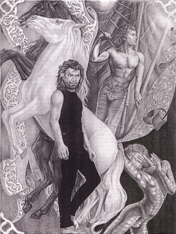